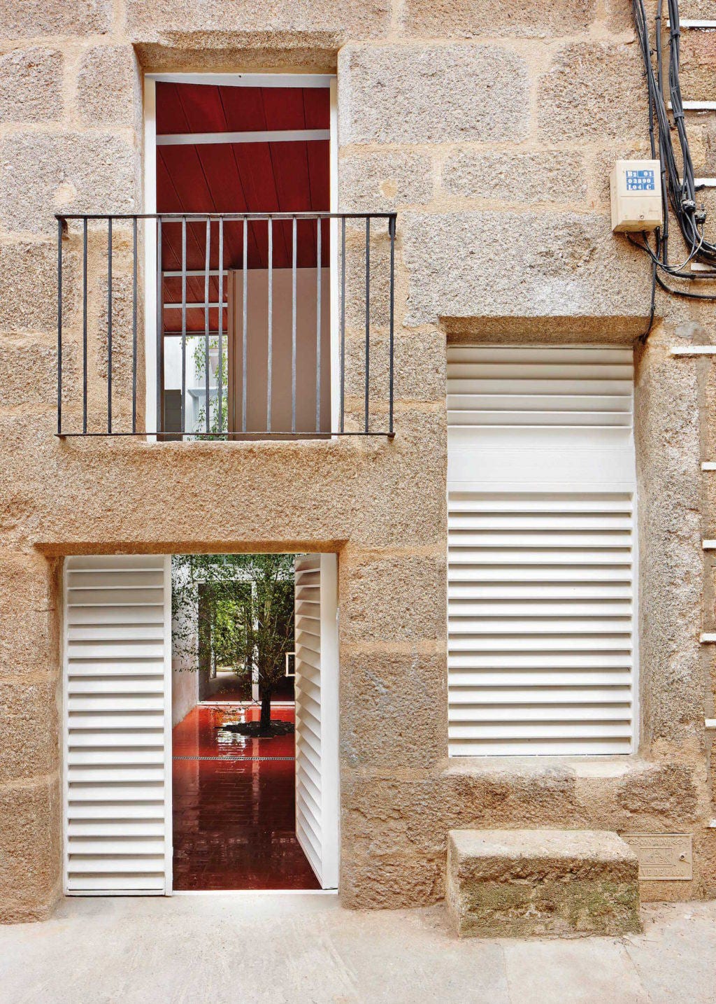


This is a village house between party walls with a long and narrow plan shape, open at the back to a yard. In time, the abandonment led to a dilapidated house. Luz, the owner, wanted a house with lots of natural light and related to the outdoors and the yard. In its original condition the central area of the house didn’t enjoy natural light or ventilation. These factors, together with a low budget, led to a strategy of simplifying and purifying the design of the project; cleaning and emptying the interior of the existing house, leaving the stone façades and rammed-earth party walls while arranging the new house around an interior courtyard. There are times when there is no preference to use contemporary materials, but to use local know-how and reliability of natural materials adapted to the economic and geographical context. This is one of them.
Surrounding the courtyard, 4 floors are built at different levels. Each of these contain a single use; kitchen, living room, bedroom 1 and bedroom 2. The courtyard is dominated by a birch tree, so that the living room and kitchen are among the green interior and the green garden. The stairwell runs through the living room and kitchen, preventing the circulation close to the bedrooms, which are located between the courtyard and the main facade. Each room has its own bathroom, fully open to the patio and with dual access from the room and the corridor itself. Choosing a deciduous tree guarantees us a shadow in the hottest season, while in winter lets in the sun to heat and light the rooms. It also works as a visual filter between spaces. The metal walkway goes around the courtyard, allowing a double inner-outer circulation. Besides functioning as circulation, the walkway can also be used as a bench where you can sit, extending the program inside to the heart of the courtyard. In the rear of the ground floor there is the summer living area. This room is designed so that it can be fully opened to both the courtyard and the garden, to enjoy the cool breeze in the summer.
The structure and construction are overwhelming in its simplicity. The work shows its pure materiality and deliberately contrasts with irregular textures of rammed-earth and stone, which have been whitewashed. It has sought an atmosphere where the red color of the ceramic and the intense green birch predominate, and it’s the light that bathes these materials through various shades of the walls and floors throughout the day. The ceramic material itself gives us the desired texture and warm color, so paintings or false ceilings were unnecessary.
Ceramic piece. The lining of the bathrooms is white gloss glazed tile of 15 x 15 cm. In addition to being hygienic and waterproofing, they reflect the tree leaves and the light of the courtyard, which increases the effect. Existing gaps in the front facade limited the position of the new floors, so these floors should be placed without limiting the height of the interior spaces. The solution was to choose for unidirectionalslabs of IPE 100 profiles, whose lower wings wear tongued ceramic boards of 1m length. Adding the compression layer we obtain a 15 cm thickness of the complete floor. The entire ground floor is covered by a large blanket of red “baldosín catalán”, which goes along with the ceiling and defines the basin of the tree.
Tile of Spain Awards ASCER 2013. Prizewinner Interior Design category
Private
Jonathan Arnabat
Jordi Ayala-Bril
Aitor Fuentes
Igor Urdampilleta
José Hevia