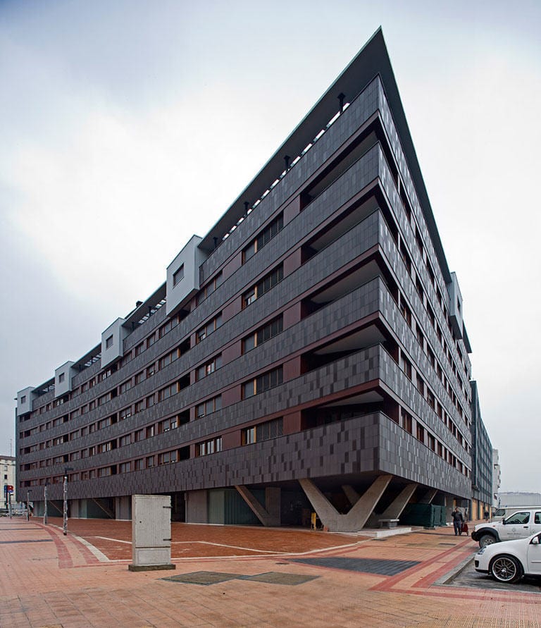
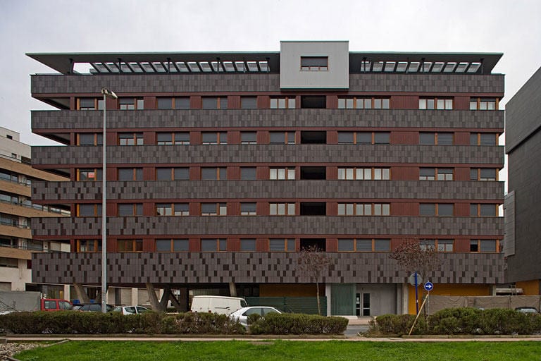
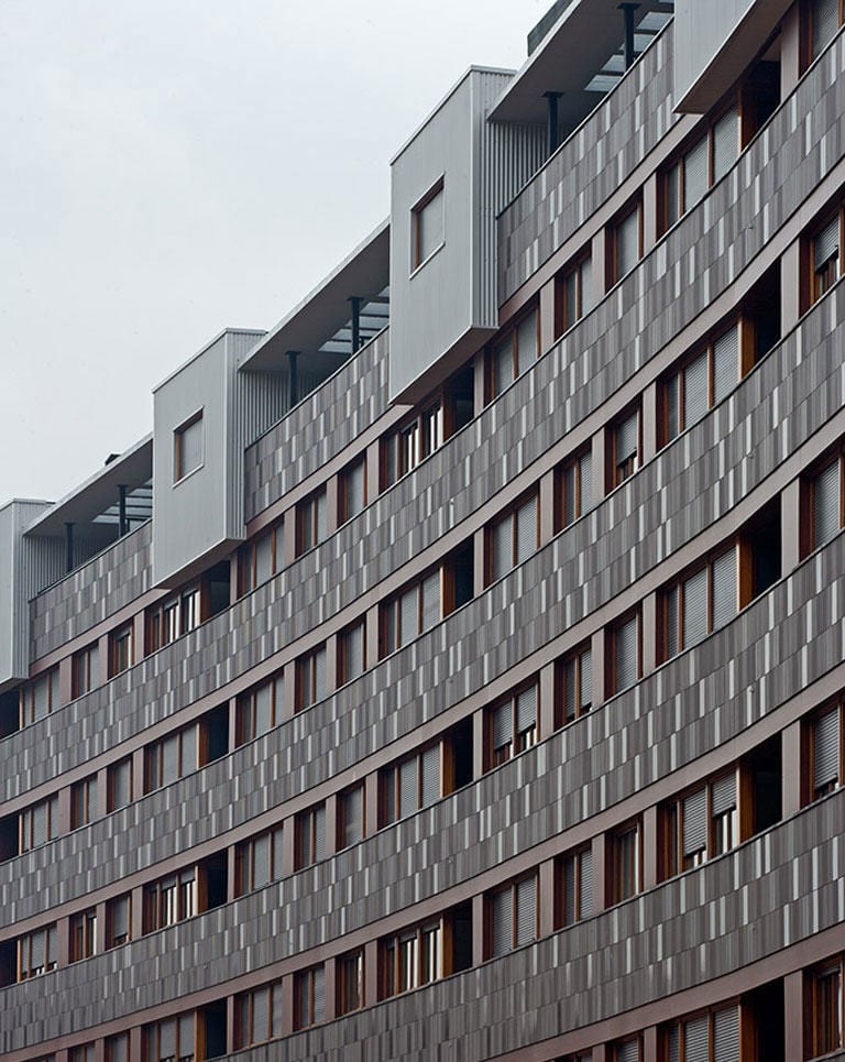
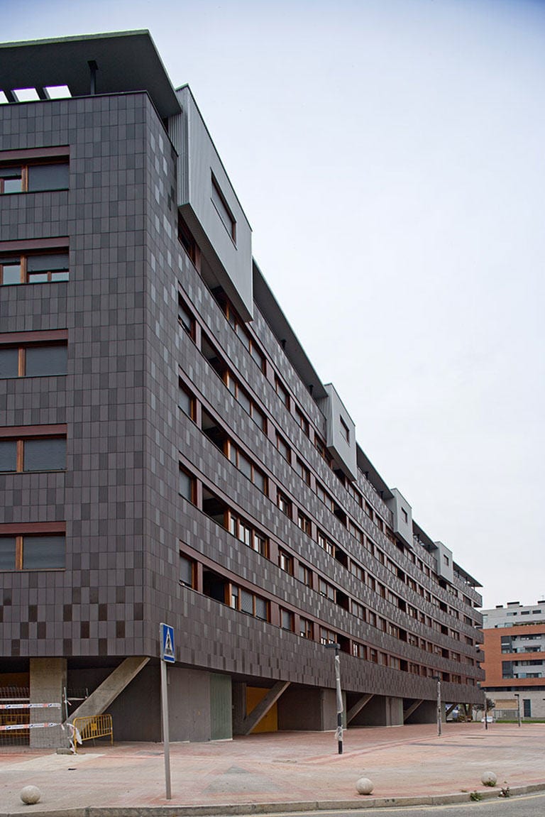
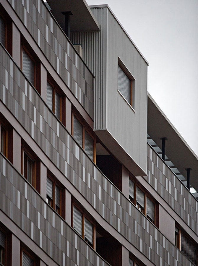
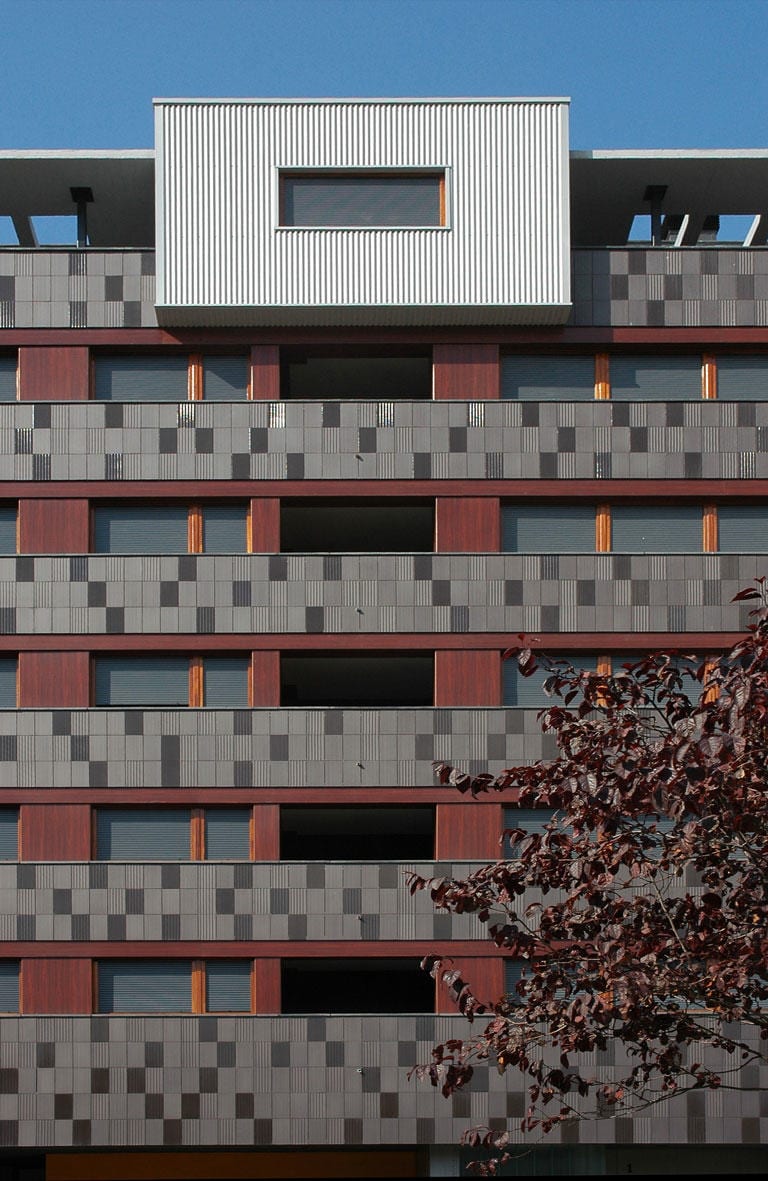
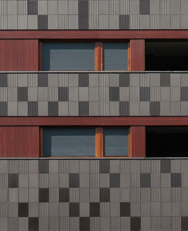
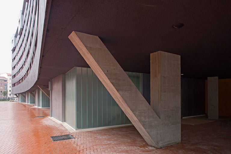
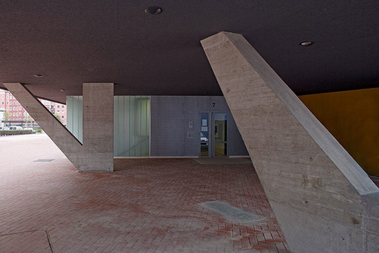
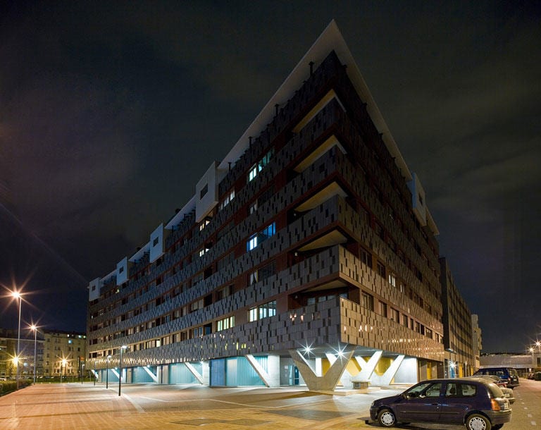
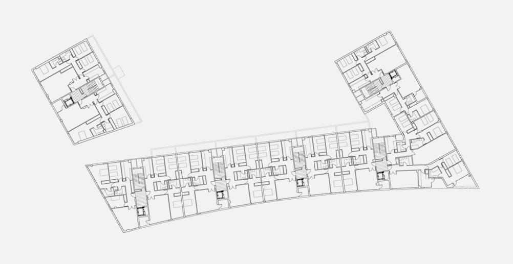
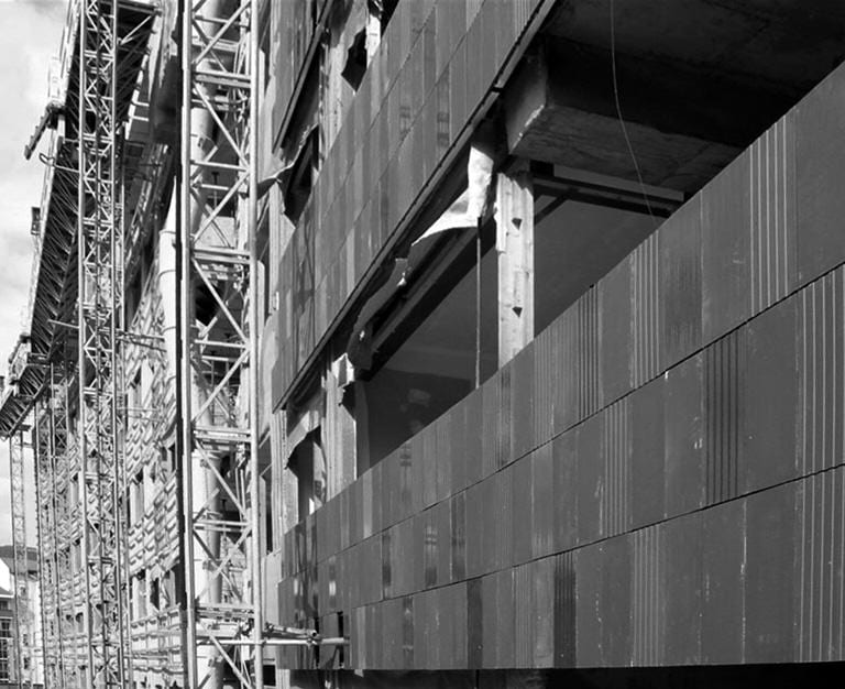
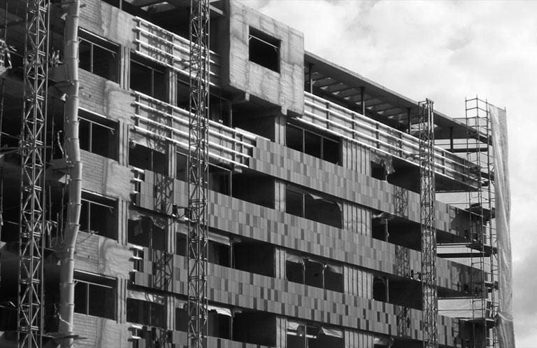
The building facade is composed of horizontal bands with continuous lines of holes in which windows and terraces alternate, reinforcing the curvature and also its unity, and giving it a proper urban scale. It is also topped by a penthouse level whose terraces are interrupted by metal clad volumes which impose a rhythm in the building, which would otherwise be too horizontal. The floor plans are more conventional with two apartments per landing and the top floor has large terraces, especially those on the sharper corner of the building. In terms of structure, we wanted this to correspond to the horizontal and heavy character of the building. It is made from reinforced concrete “V” pillars on the ground floor, so as to reduce their number and make, at the same time, the weight of the building more significant on them.
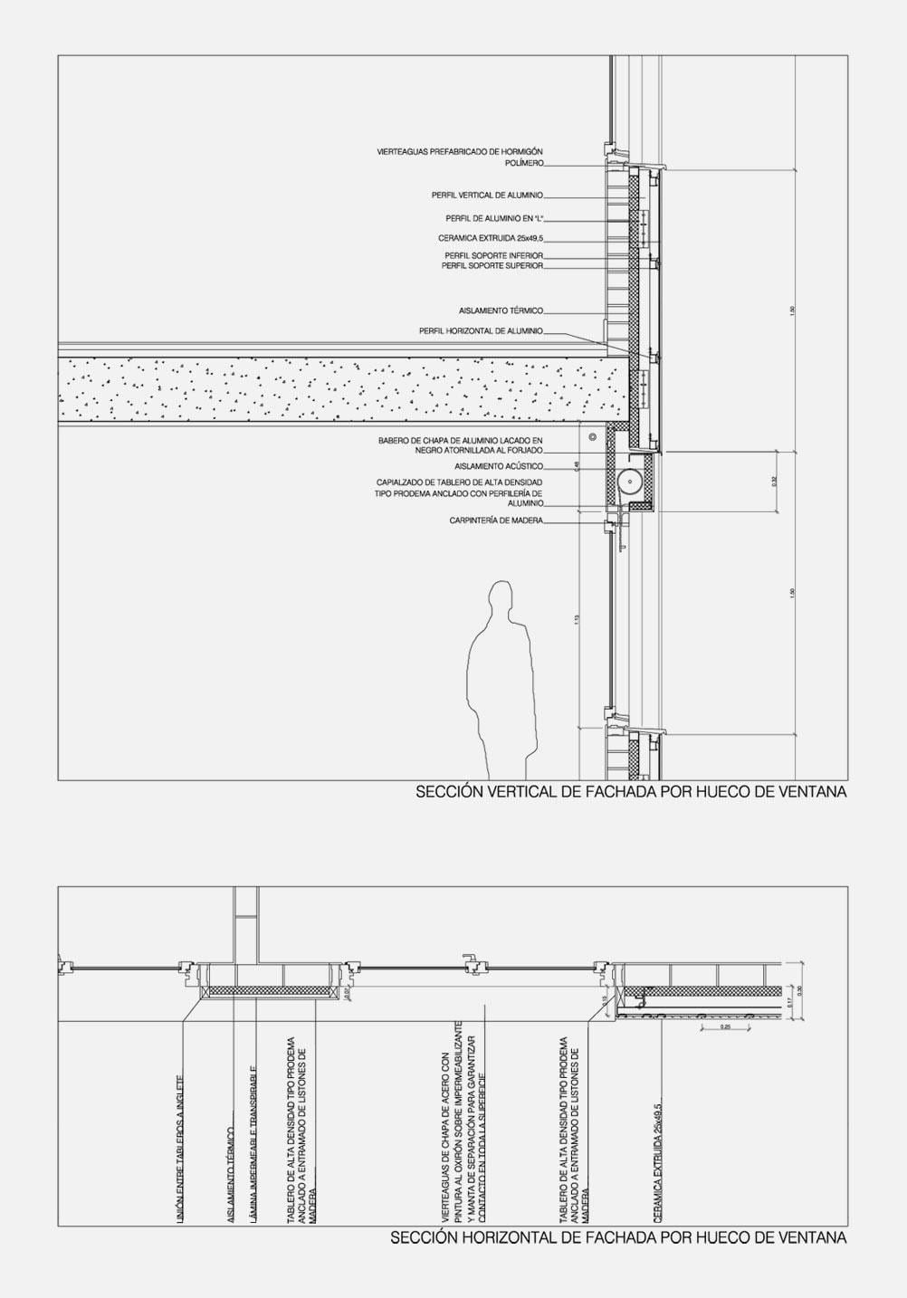
Given the nature of the project, which sought the contrast between weight and lightness, with weight marked by horizontality and its relation to the pillars on the ground floor, and height by the continuous lines of holes, materials that were consistent with these effects were sought, helping to strengthen them. Different alternatives were therefore considered, always based on materiality. An initial solution in precast concrete was considered and then discarded, both because of its excessive uniformity and because a dark yet bright looking colour was sought, which was incompatible with the existing products on the market. Consequently, a ceramic facade was chosen.
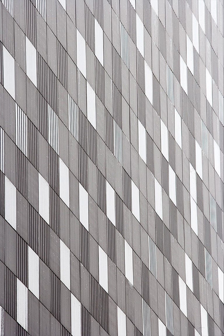
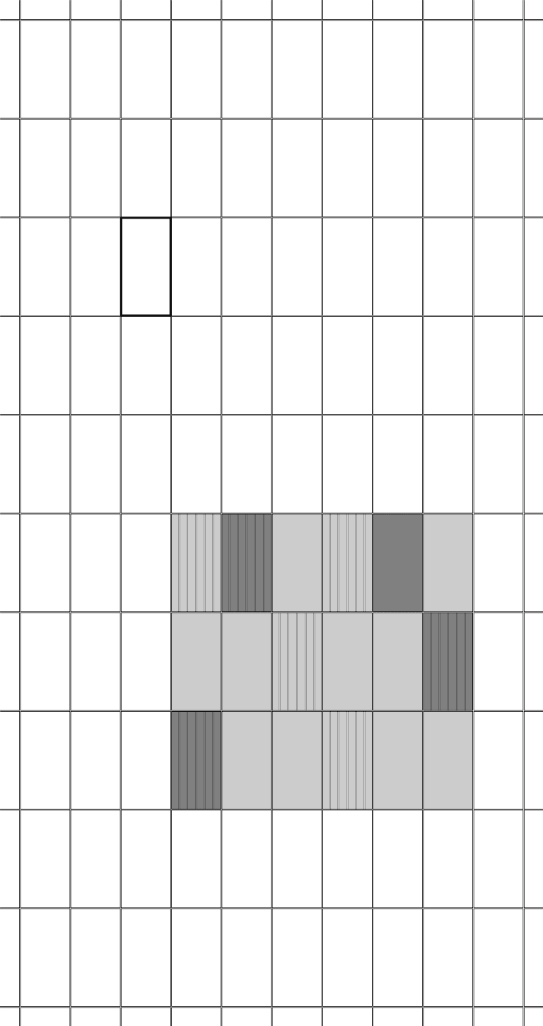
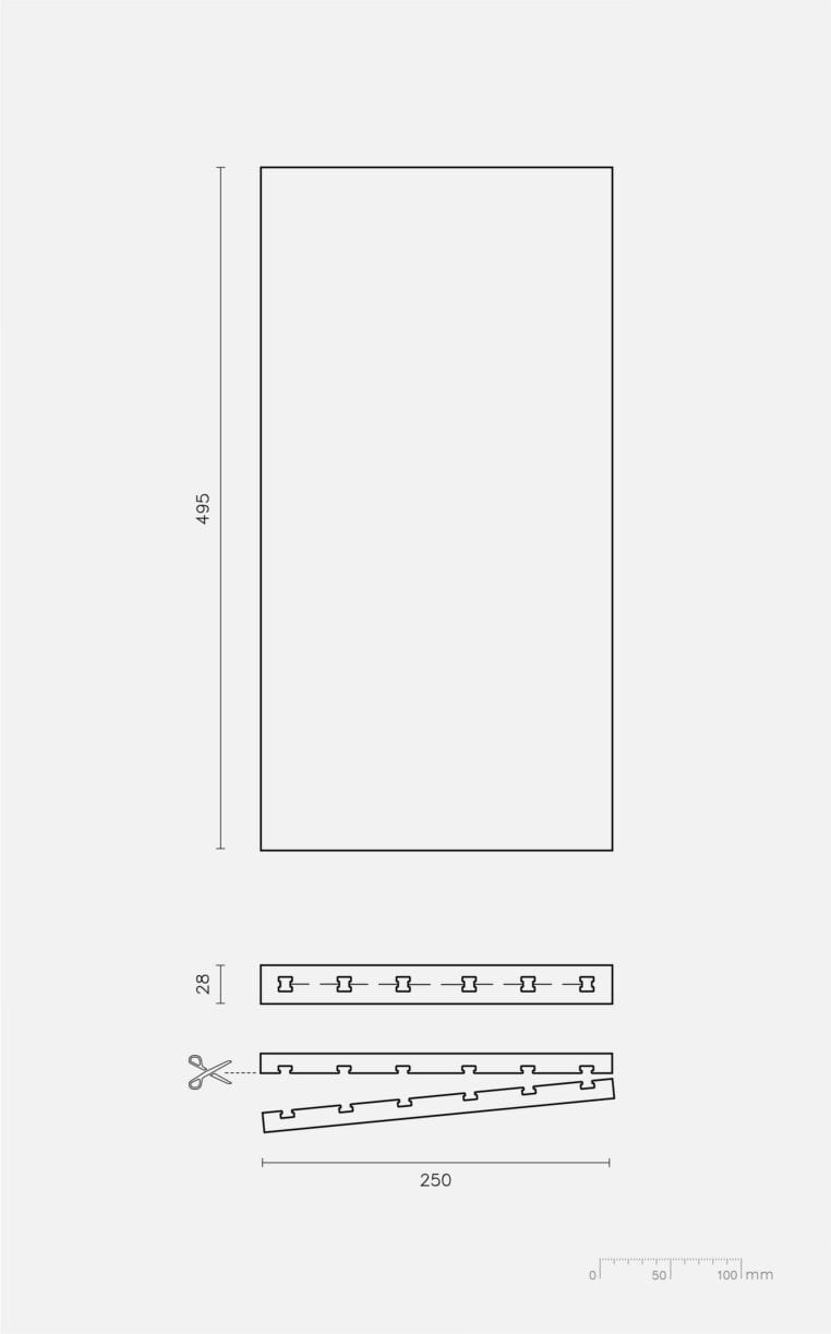
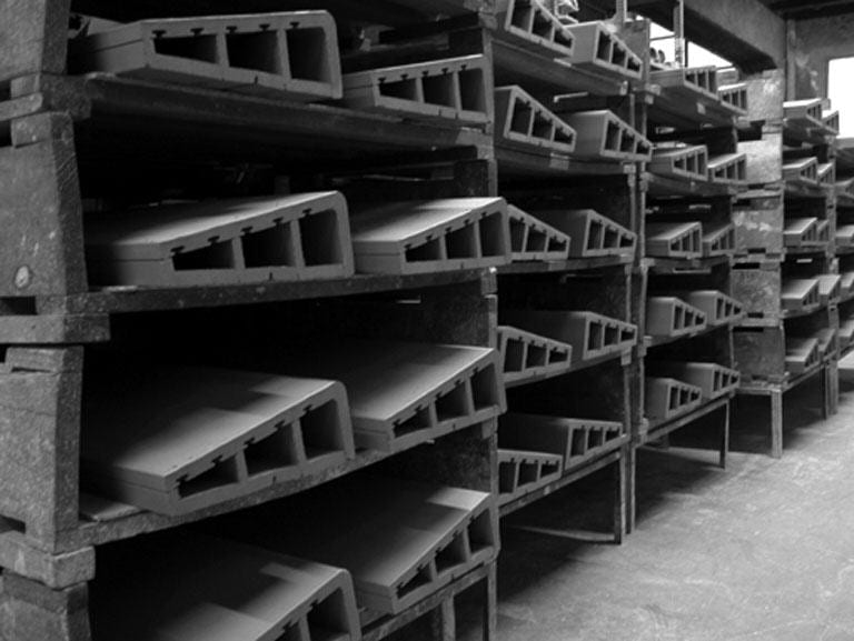
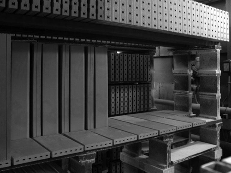
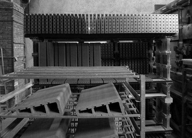
Ceramic piece. To develop the ceramic ventilated façade, pieces of different kinds are made so that when combined with each other, gave a set of very suitable textures for the variability and toning effect that was initially pursued (and which was, in this case, enriched). The pieces have a matt and gloss finish, always with a dark gray tone, with the matt piece being alternately placed backwards to enhance the texture.
